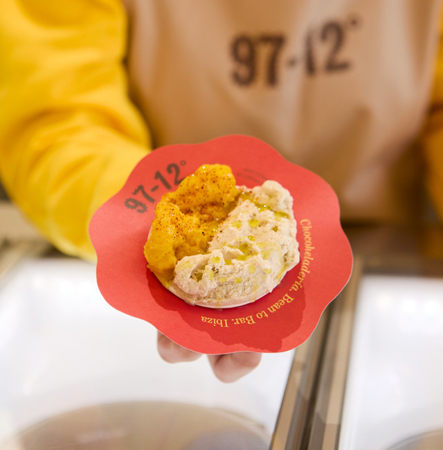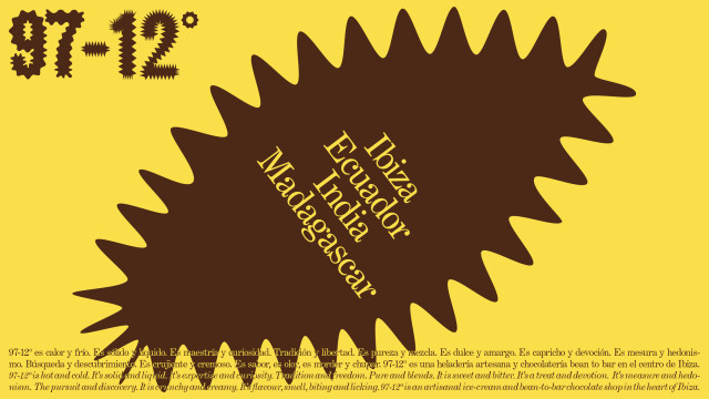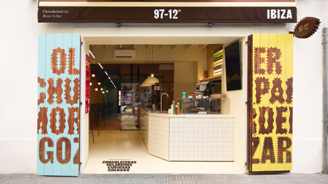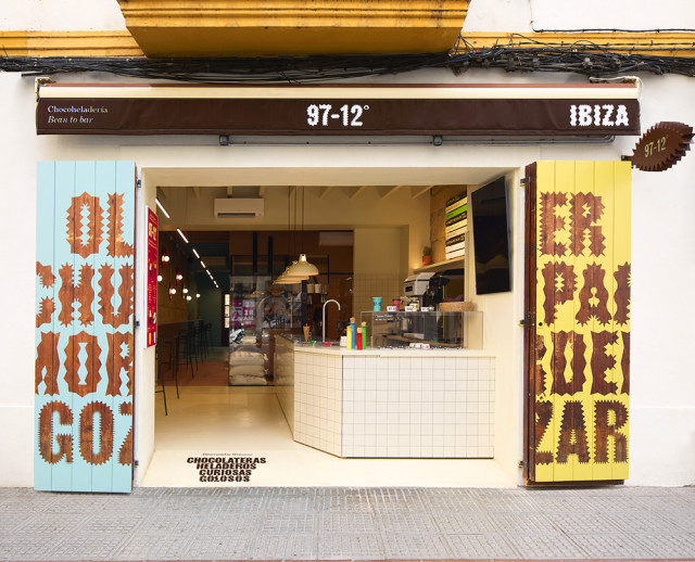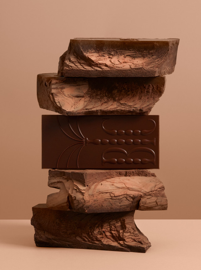
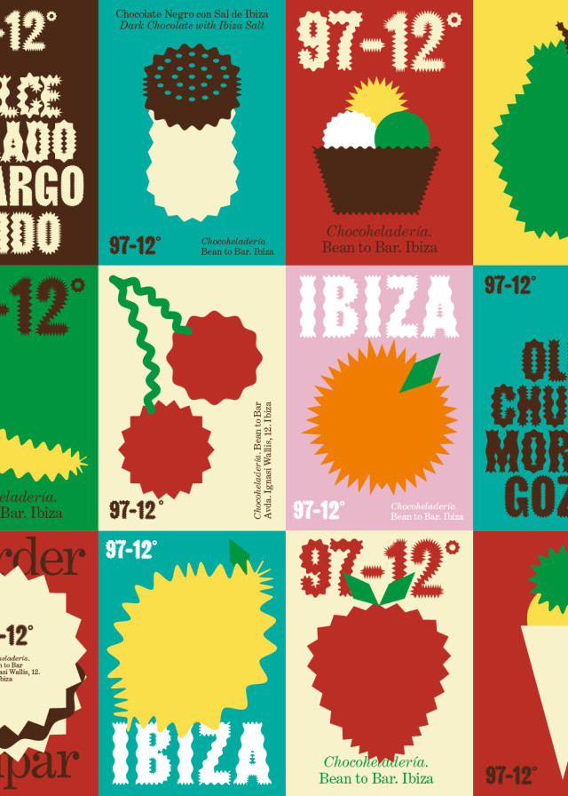
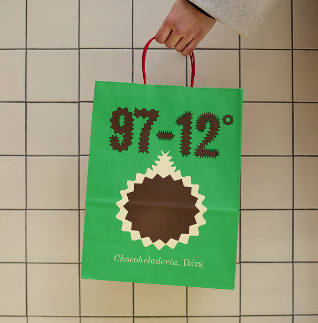
97-12º is a bean to bar chocolate & ice cream shop located in the heart of Ibiza. Two numbers full of meaning: 97º, the temperature at which cacao is roasted; and 12º, the temperature at which the ice creams are frozen.
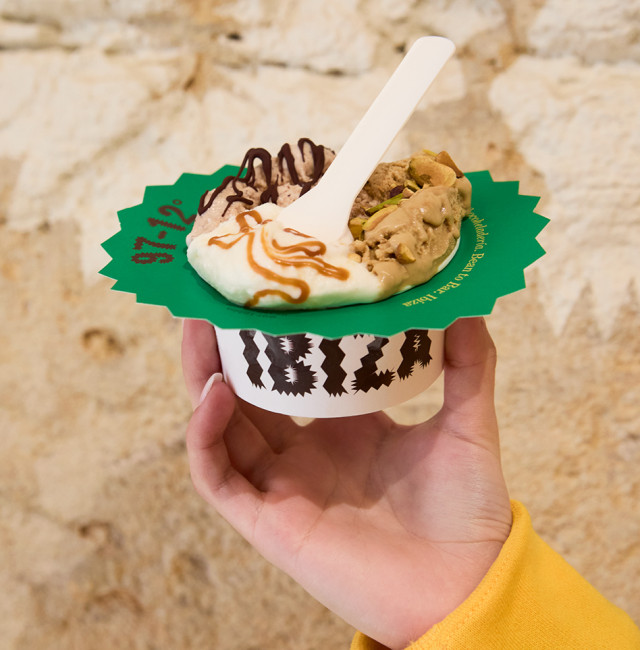
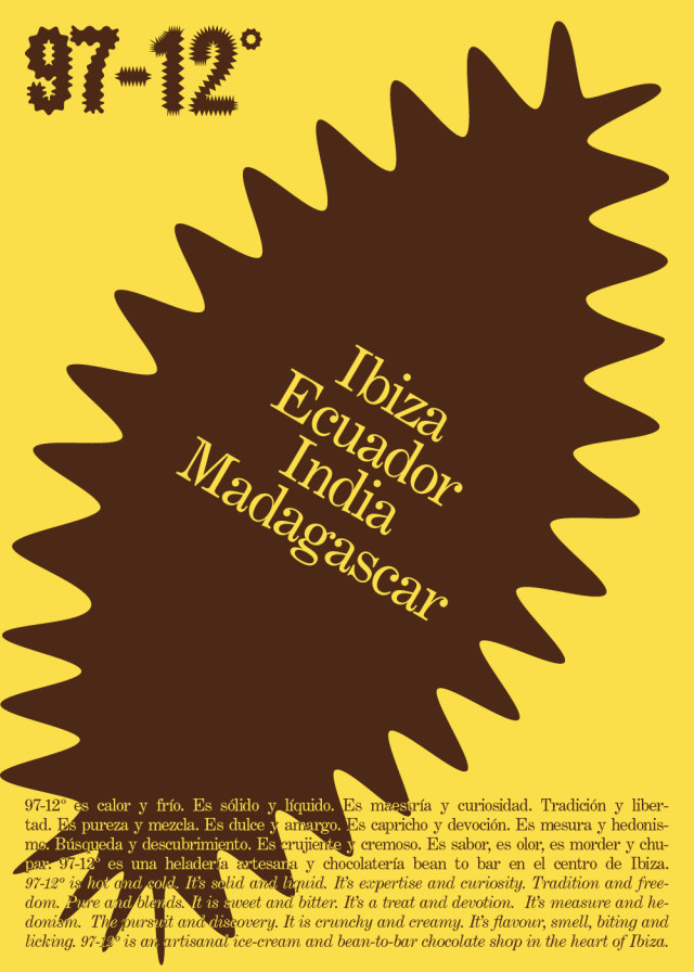
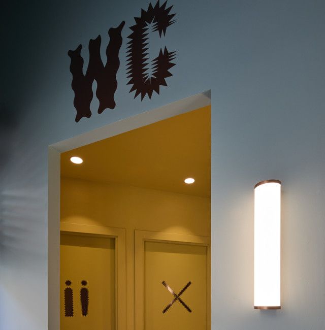
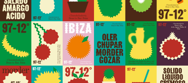
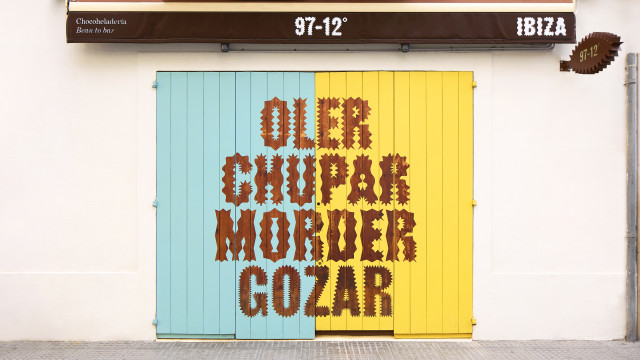
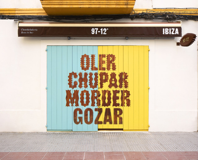
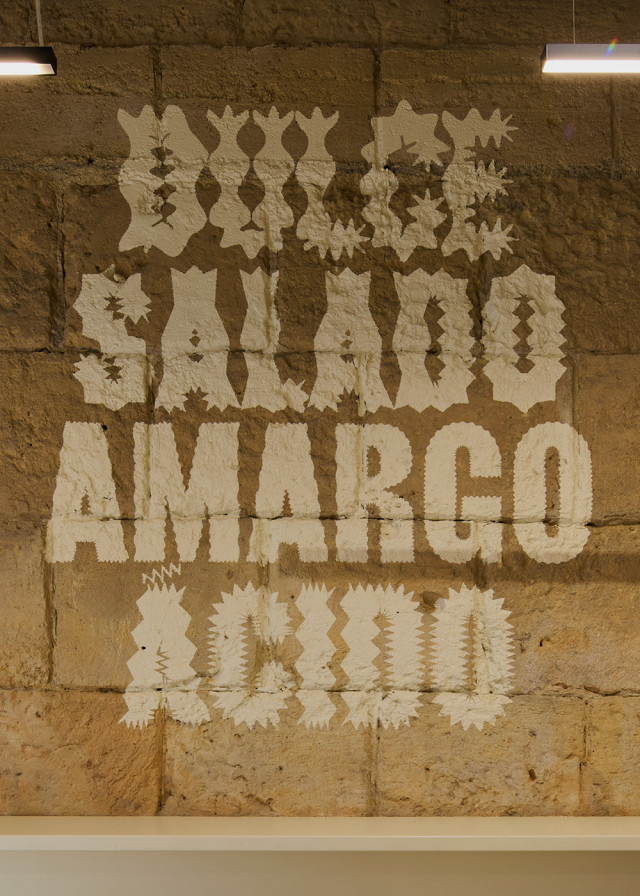
We developed a custom typeface for the logo, inspired by the temperatures that give its name to the project. The alphabet features characters that either melt from heat or crystallize from cold, with their intensity varying according to the temperature.
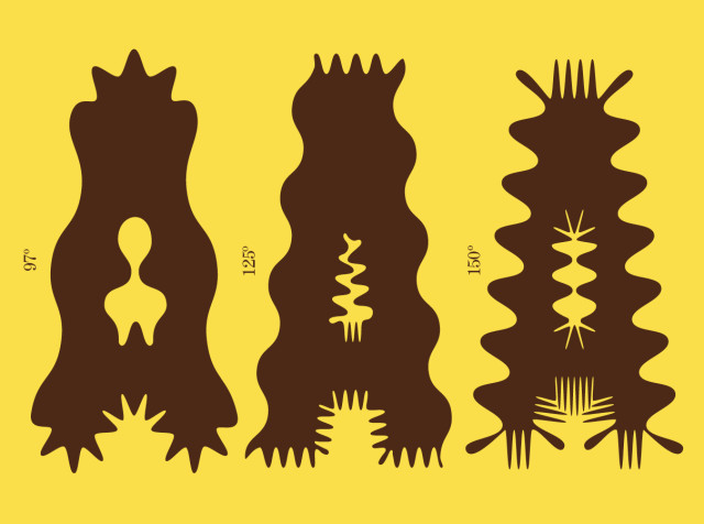
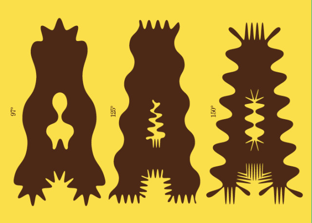
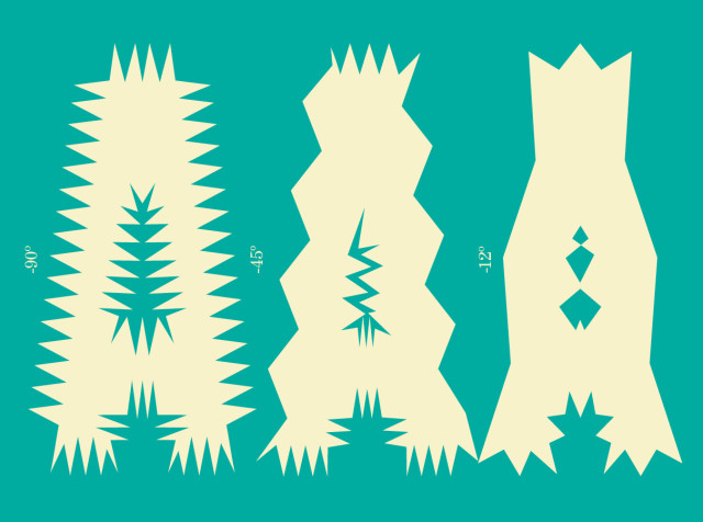
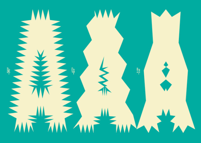
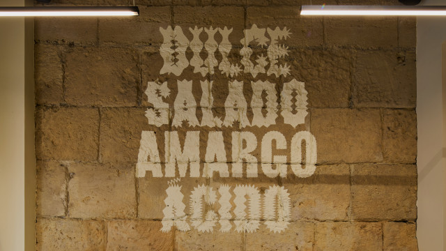
Different versions of the typeface are created, highlighting its edges or its sinuous forms to evoke different degrees of temperature.
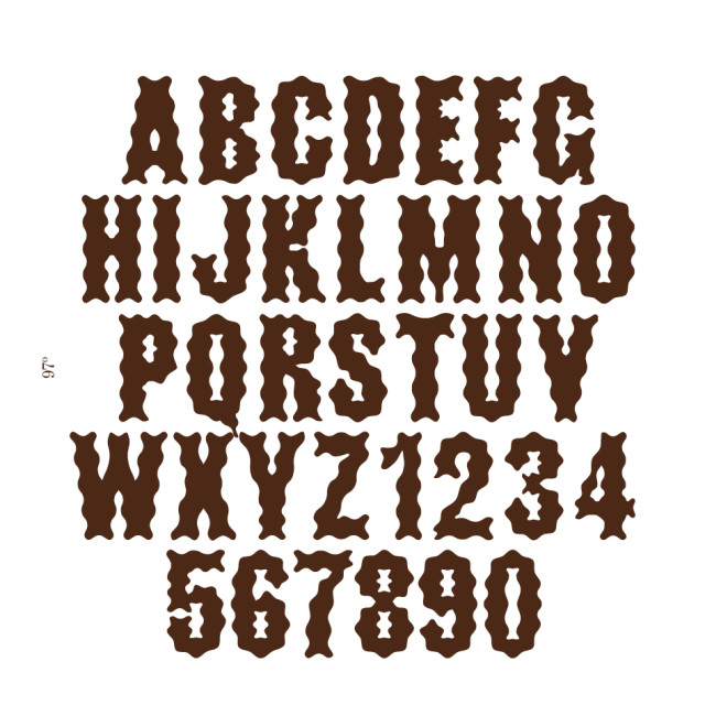
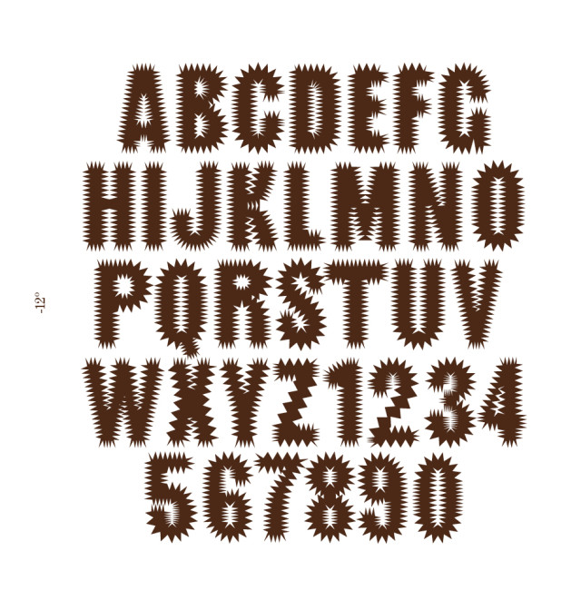
We applied the same effect to the illustrations, creating a versatile and dynamic system that highlights technical mastery while connecting with the audience through fun and playfulness.
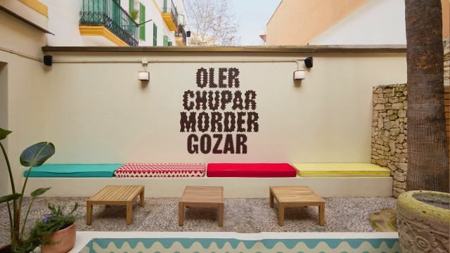
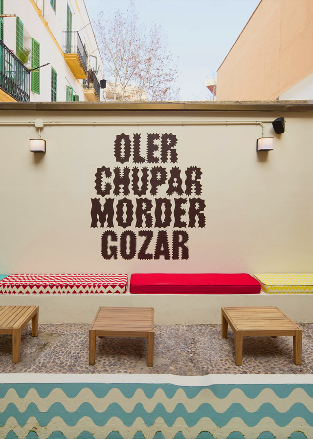
The verbal identity aims to evoke sensations, playing with contrasts and the brand’s inherent duality. The messages present concepts that are sometimes opposing, sometimes complementary.
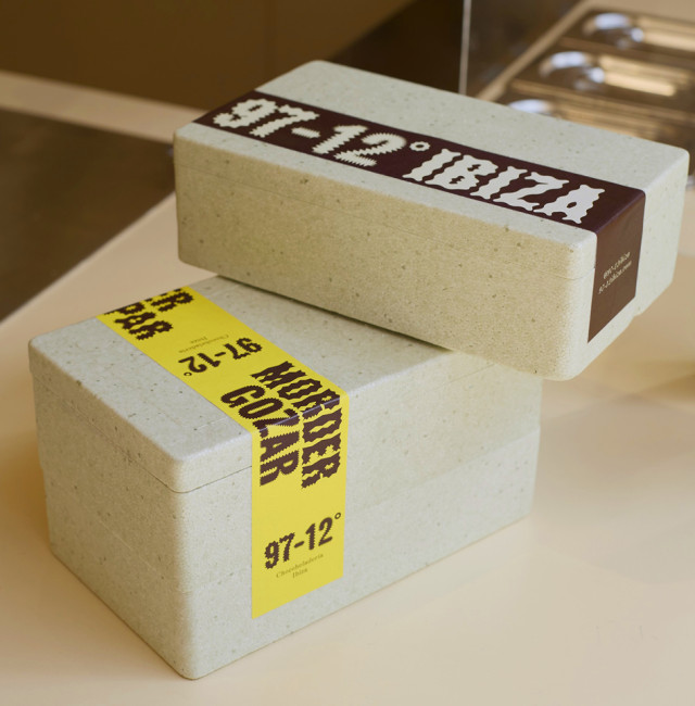
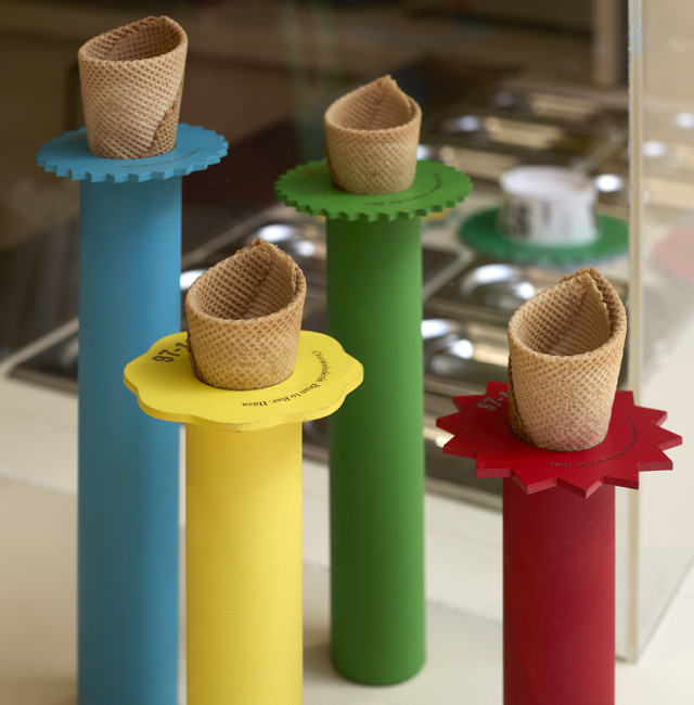
The degree symbol in the logo becomes a functional element that adapts to cups and cones, preventing toppings from falling off. A simple and cost-effective gesture that adds a distinctive touch to the product.